Created with sketch, Illustrator, and invision
UX CASE STUDY: Designing Meeting Room Booking Application for Businesses
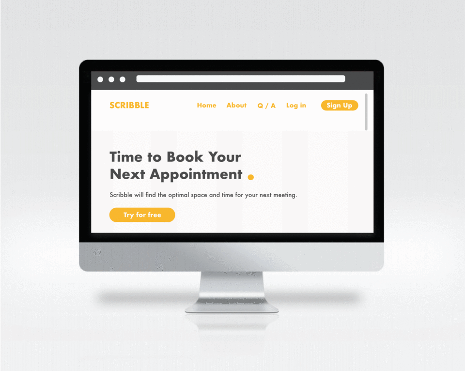
Scribble is a meeting room booking software. It’s a one stop application for hosts and invitees (guests). The application is designed to speed up the process of coordinating meetings and keeping shared spaces easy to access. Scribble helps professionals stay autonomous while booking the right rooms for their needs.
THE CHALLENGE:
Designing an application that can integrate into any office setting. From small to large buildings, Scribble needs to adapt to the user’s needs. Manage all bookings and related tasks within a single platform.
THE AUDIENCE:
The users are professionals from any industry working in office buildings. The application is designed on the behalf of those coordinating or attending meetings in shared spaces.
GOAL OUTLINE:
Integrate participants calendars and info for scheduling.
Make room information easily accessible.
Make recurring meetings available to book without booking conflict.
Design the UI by building a color palette, typography, icons and other UI Elements
SCOPE OF WORk
User Research
Product Research
Platform Research
Competitor Research
Research Analysis
Mind Mapping
Personas
Site Map
Task Flow
Design Ideation
Idea Sketches
Wireframes
Prototypes
User Testing
Design Iterations
UI DESIGN
Icon Design
Branding and Style Guide
Layout and Responsiveness
UI Prototypes
RESEARCH PROCESS
Product AND COMPETITOR RESEARCH:
As research for user’s needs, I surveyed professionals that already use a booking application for shared spaces. Hoping to learn more about what they like about their existing applications and hopes for improvement. Overall, users felt comfortable using their applications. They enjoyed they could easily access peer information through the application. However, there were room for improvements that caused time and frustrations when booking rooms. Below are common pain points.
Finding a consistent room that’s available across weeks.
When a room is booked, it’s difficult to find an alternative with the necessary capacity.
Not knowing which conference rooms allow food.
Not knowing which conference rooms are fully equipped for AV.
Not knowing where the room is located in the building. If you work in a large building, it can take time to get familiar with all and every location of available conference rooms.
I researched existing booking applications for more user research. Overall, competitors did a good job displaying options for days and times. Some integrated company information well like linking employee’s outlook so information was accessible. However, I found it challenging to book outstanding meetings. Likewise, if a room was already booked, it was challenging to find alternate room options for the specific day and time.
Mind Mapping:
Extracting the knowledge from the user questionnaire, I created a mind map. Mind mapping helps me string together thoughts and list into a coherent visual. I can pull from the mind map when I start designing the information architecture. It helps me organize information into more defined ideas, establish relationships and hierarchy amongst those ideas.
Personas:
Who uses room booking applications and what are they looking for? The results of the user survey revealed several types of users with diverse needs. Focusing on the user’s frustrations and goals, I designed three unique personas demonstrating the collected data.
Site Map:
Gathering data from the mind map and the personas, I designed a site map. The map explains the navigation through the application. Creating the site map helps me show the relationships between the different pages. It provides the first blueprint and something tangible to design from.
Task FLOW:
Applying one of the personas, I created a task flow reflecting a potential scenario.
Julie is looking to book a conference room for 6 people. It’s a lunch meeting at 11 a.m. for 2 hours on July 11th. The meeting is catered and needs a room accessible for food. Here is the task flow for booking the room.
DESIGN IDEATION
Sketching:
Sketching on paper is helpful to process ideas without taking too much time or being precious with the aesthetic. Taking the notes from the user survey and site map, I sketched up the wireframes a user will find most useful. The wireframes illustrate the navigation from the main page to the login page. Once the user logins, they have the option of clicking on the calendar, the booking tab or viewing profile.
Wireframe:
Based on feedback of the paper prototypes, I digitalized the wireframes using Sketch. Still focusing on navigation and functionality, I designed in grayscale to minimize distraction.
UI Design
During the research process, I collected images that focus in user design. Driven to create an empathic application that helped people with an everyday task, it was important to me it also felt pleasing to revisit. Designing for a playful experience, I drew inspiration from illustrations and colorful palettes. Building a resource library is key before the UI designing begins.
PROTOTYPES:
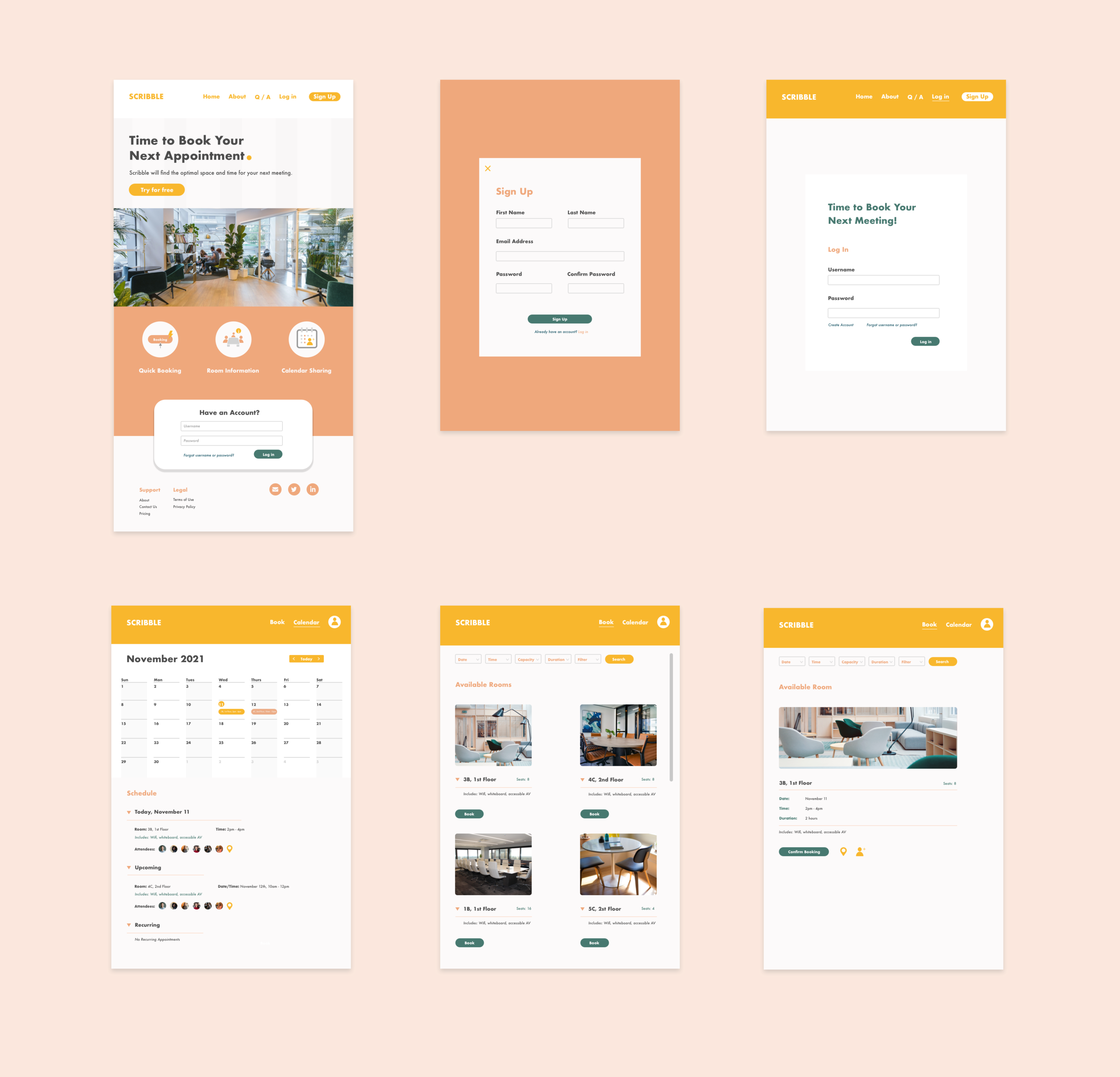
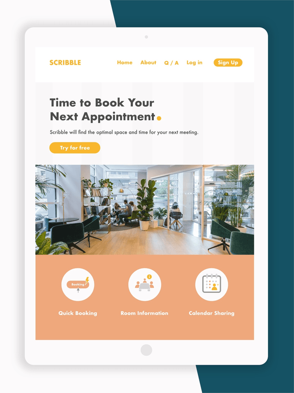
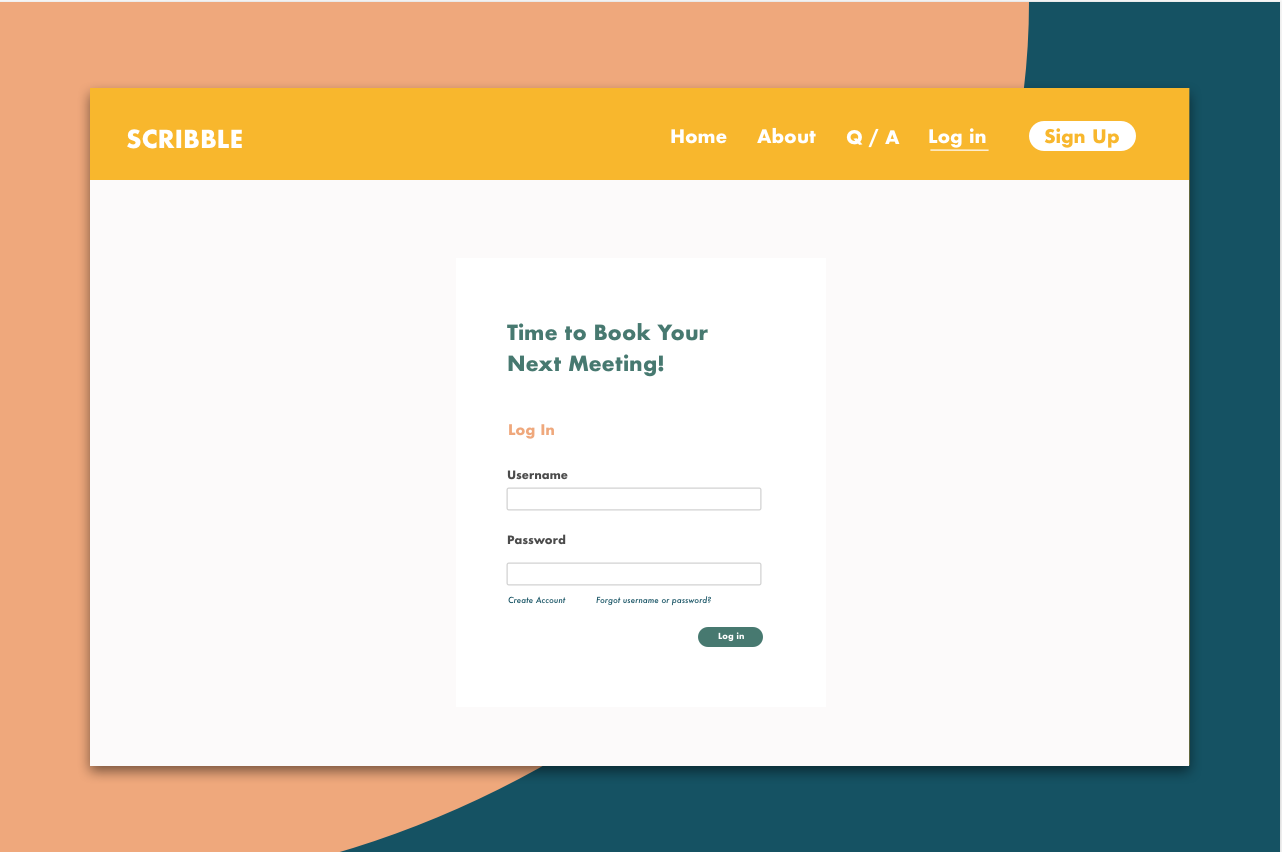
Marrying the wireframes and the UI, I designed a website that could viewable on all platforms. Incorporating the notes from user testing and surveying, I aimed to make information available. It was important that users could filter for their needs early on in the search process.
Click for Desktop UX