Created with Figma, Adobe XD, and Sketch
UX CASE STUDY: Designing a responsive cooking tutorial website for desktop and mobile.
Better Made, a cooking tutorial website, is dedicated to accommodating a diverse audience. The platform caters to various learning approaches, breaking away from the conventional method of reading step-by-step directions. The incorporation of video elements caters specifically to visual learners, while audio components provide support for those who prefer learning through listening.
In my role, I designed a responsive website tailored for both desktop and mobile users. The focus was on creating an inclusive space for all home cooks, considering their specific needs and abilities.
THE CHALLENGE:
Home cooks learn in different ways and possess different skill sets. They may experience boredom, forget preferred recipes, or lose track of dishes they intend to make.
THE AUDIENCE:
The main demographic is home cooks with no formal training in culinary who cook at least once a week. Ranging from ages 10-70, including individuals with accessibility needs (i.e., closed captioning).
The GOAl:
Designing a responsive cooking tutorial website for desktop and mobile. The site helps cooks find their desired recipes based on their specific needs. Better Made distinguishes itself from other recipe websites by prioritizing the variety of ways people learn how to cook.
SCOPE OF WORk
Ideation
Design exercises,“How might we” and Crazy 8’s
Paper Wireframes
Digital Wireframes
Low-fidelity prototype
UX Research Process
Product Research
Accessibility research
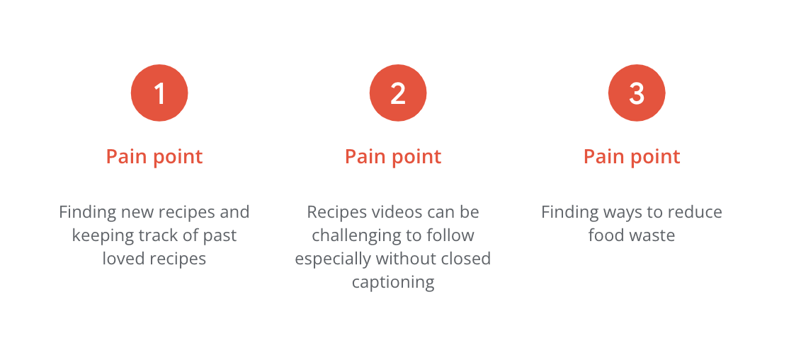
Pain Points
Empathy Map
Personas
Problem Statement
User Stories
User Journey Maps
Competitive Audit
Site Map
Task Flow
Usability Study
Create study plan
Conduct Unmoderated Studies
Affinity Map
Design
UI Design
Style Guide
Mockups
Design Iterations
High-fidelity Prototype
UX Research Process
While researching for BetterMade, I focused on identifying the gaps in existing cooking platforms. I conducted competitive audits and created empathy maps, targeting untrained cooks ranging from 10 to 70 years old.
I needed to understand the user's relationship with cooking for this cooking tutorial website. How do they transition from considering making a meal to successfully cooking a dish? How can we encourage them to return? What sets BetterMade apart from other cooking tutorial websites? Conducting a competitive audit helped me understand the current options available for home cooks.
I considered possible pain points like accessibility, aiming to provide tutorials through both audio and visual learning methods. This goal raised concerns about costs and the limited quantity of recipes since videos are more time-consuming and expensive to produce than text recipes. We needed to understand why this approach was crucial and how to make it competitive with other platforms.
During the research process, I asked these questions:
Do users understand how to navigate the site and mobile app?
Do users enjoy the process of searching for videos?
Do users feel confident with the resources provided in the recipe or video?
Do all users find the site accessible?
What makes this site different from other cooking sites?
Accessibility cHECKLIST:
Followed WCAG guidelines for color contrast accessibility.
Considered and researched screen reader abilities.
Implemented closed captioning for cooking tutorials .
Pain Points:
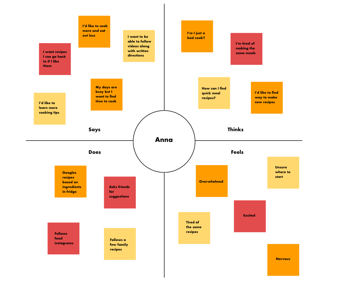
Empathy Map:
During brainstorming, I map out the customers' experiences, thoughts, and feelings, gaining a deeper insight into the user. In this example, Anna's persona expresses conflicting feelings of excitement and overwhelm while searching for recipes based on ingredients in her fridge. Empathy mapping reveals her eagerness to cook but also highlights Anna's self-doubt. A key takeaway is to find ways to boost the user's confidence.
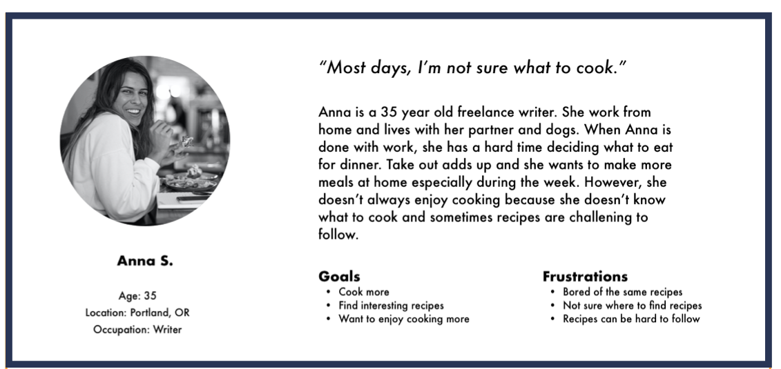
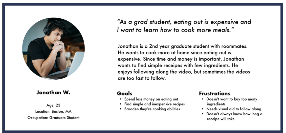
Personas:
I created three personas that reflect the target audience while designing for a diverse user base. I aimed to include a diverse skill set, intentions, and physical abilities in these personas. These personas not only represent a broader audience but also emphasize individual needs.
pROBLEM sTATEMENT:
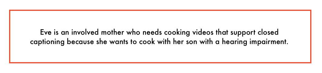
I wrote a problem statement based on Eve’s persona to reflect her lifestyle and priorities. This statement aligns user needs, defines challenges, and specifically targets improving accessibility for hearing impairment.
User Stories:
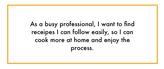
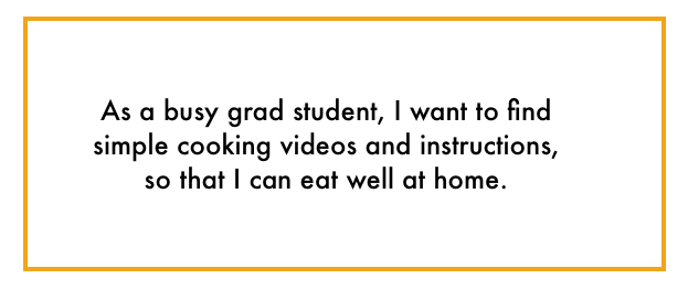
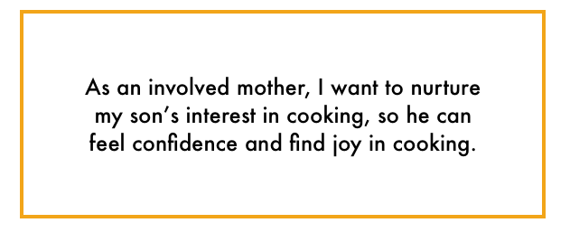
Creating user stories helps us understand what users need and want. Being specific about the user's story is crucial for the product's success. Each story expresses the “who” , “what” and “why”. For example, the first story explains the person is a busy professional, what they want is easy to follow recipes because they want to enjoy cooking more.
User Journey Map:
I made a map to show how people use the Better Made website. This helped us see the whole user experience and find things that might be tricky. When we looked at how Eve uses the website, we found out that it's important to have easy recipes for kids and videos with closed captions.
Competitive Audit:
I performed a competitive audit to learn more about the direct and indirect competitors in the food customization app space.
Our key competitors are Panera Bread and Corner Bakery, fresh ingredient chain cafes. Both restaurants are nationwide, offering ingredient breakdown and customization on their apps.
The indirect competitors are Porto’s Cafe, a family owned business with locations in the Los Angeles area. Starbucks is an indirect competitor. Though they are a worldwide chain cafe, they are less of a competitor for food and customizing healthy ingredients. Their food is pre-made and warmed at the cafes.
“How might we” exercise:
How might we make the videos accessible for those with hearing disabilities?
How might we make this website helpful, engaging and easy to use?
How might we make this website a place people use repeatedly?
How might we make this website a place for people to build confidence in cooking?
How might we make this website a place for everyone - all ages, abilities, finical resources?
Here are the strengths and weaknesses I identified through my use of the four apps.
Panera Bread Weaknesses:
Only available in English
No audio assistance
Have to login for checkout
Panera Bread Strengths:
Visually appealing
Allows to custom every item on the menu using checkboxes
Includes the ingredients of every product
Free reward membership
Corner Bakery Weaknesses:
Navigation is confusing especially with subcategories
Lacks a strong brand identity
No accessibility button
Corner Bakery Strengths:
Images for every item on the menu
Face recognition for login
Free reward membership
Porto's Bakery Weaknesses:
Have to login for checkout
Limited ingredient information
Only available in English
Porto's Bakery Strengths:
Easy to navigate
Lots of images and details
Allows for advance ordering
Starbucks Weaknesses:
Have to login for checkout
Limited amount of accessibility features
Starbucks Strengths:
Visually appealing
Easy to navigate
Easy to Customize
Upon completing the competitive audit, I took a close look at areas the app can fill in the gaps. One area is creating a guest customer option for people who prefer a fast checkout without the need for account registration. I'm actively looking into adding more features that would make it user-friendly for everyone. Also, focusing on providing more details about the ingredients on the menu items. Lastly, developing a user flow that is simple to follow, providing helpful guidance and an enjoyable experience for use
Site Map:
While planning the sitemap, I consider how to lay out the structure and hierarchy of the tutorial pages. I prioritize organizing content for users' comfort, reducing frustration, and enhancing engagement.
The sitemap starts at the homepage, where users can choose from the search bar or drop-down menus (meals, cooking experience, holidays and events, and dietary and lifestyle). Each main category has subcategories, such as breakfast under meals and vegetarian under dietary and lifestyle. Multiple navigation paths ensure users can find the recipes they want, even if some overlap.
I think about how users search for recipes and how to get them there quickly. Some users go straight to the search bar, while others explore the drop-down menu. I ensure the categories cover enough options without making subcategories too long and difficult to review.
Task FLOW:
I applied Anna's persona to create a task flow reflecting a potential scenario.
Anna finishes her workday at home and needs to make dinner for herself and her partner. She goes online to search for dinner ideas. Unsure of what she wants to make, she reviews her options and prepares a meal. Here is the task flow detailing Anna's experience.
IDEATION
Paper WIREFRAMES:
Users can select recipes from the open page or navigate the dropdown menus. Once they decide on a recipe, they can follow it through video or text. By supporting different learning styles, users successfully create recipes.
Digital WireframeS and low-fidelity prototype:
I started the design process by focusing on the homepage and introducing users to recipe options.
After designing the wireframes, I created the low-fidelity prototype for user studies. The low-fidelity prototype guides the user from the homepage to selecting a recipe. Ultimately, the user will follow along with a recipe based on a technique that works best for them.
Usability study
Study Plan:
I conducted two rounds of unmoderated usability studies. In the first round, users remotely interacted with a low-fidelity prototype, and the insights from this round heavily influenced the creation of the high-fidelity designs. During the second round, users navigated the refined high-fidelity prototypes, identifying remaining user needs.
Throughout the study, participants were asked to navigate and follow along recipes using the low-fidelity prototype. Below, you will find the study plan and the requirements for participation.
Methodology
20 to 30 minutes
United States, remote
Unmoderated usability study
Participants
5 participants
Participants are home cooks with no formal training in culinary who cook at least once a week.
Ages between 10-55
Key Performance Indicators
Use of navigation vs. search
Conversion rates
Drop-off rates
System Usability Scale
For the unmoderated usability study, I wrote a script for participants to follow. Writing a script ensures that each user has a consistent experience, making the feedback more reliable. By following the same instructions, we can be confident that any insights are based on a uniform user journey. Below is an example of a prompt provided to participants during the unmoderated usability study.
Prompt 1: Starting on the homepage, find a recipe category using the navigation bar.
Follow up : How easy or difficult was this task to complete? Did the navigation headers make sense?
At the end of the study, each participant completed a survey. The questions were rated on a scale from “strongly disagree” to “strongly agree.” Sample questions included "I feel the site is accessible for my needs" and "I feel confident using the site".
Affinity Map:
I organize an affinity diagram by compiling notes from the user studies. Grouping users' thoughts and needs helps prioritize the next steps in the design process. These commonalities provide key insights into what is and isn't working for most users. For example, the majority of user feedback related to filtering. Users expressed a desire for more diverse filtering options to help them find the right recipe.
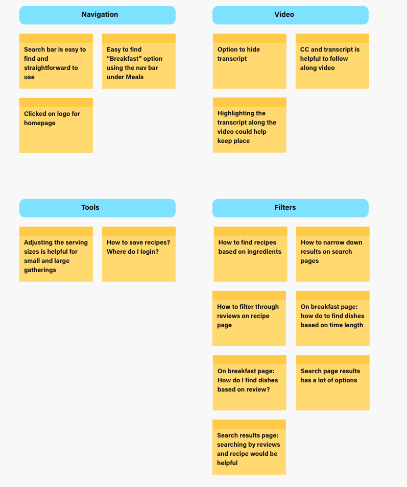
Usability Study Results:
After organizing the data from the affinity map, I outlined the key findings from the initial usability study.
People want more ways to filter through the recipes
3 out of 5 total participants wanted to be able to filter recipes based on top reviews
Some participants felt overwhelmed by the amount of options and wanted to filter out unwanted recipes
People want more tools
4 out of 5 total participants had additional user tool requests
2 participants would like to be able to save recipes and review previously made ones
1 participants requested how to adjust the serving size of a recipe
Design
UI Design:
Designing with Accessibility in Mind
When beginning the UI design process, I prioritized key accessibility elements. The questions guiding my design included: Is the text easy to read? Are users provided with multiple cues such as color, symbols, or clear call-to-action words? Ensuring that the interface accommodates home cooks with varying abilities was central to developing a product that would be successful for everyone.
Color Palette Considerations
For the color palette, I wanted to incorporate the color red, which is psychologically linked to food and appetite. However, I also focused on creating a palette with strong contrast to meet accessibility standards. The goal was to achieve a visually appealing design that remained functional for users with visual impairments or color blindness. This balance between aesthetics and accessibility ensures that all users, regardless of their abilities, can engage with the app seamlessly.
Mockups and Prototypes:
Building mockups for the website is the next step toward completing the final product. Creating detailed high-fidelity designs shows how the project has evolved from early concepts to polished layouts. With these designs, users can interact with the interface and see the user experience (UX) decisions in action. These mockups will also guide future user testing and feedback.
After conducting user studies, I reviewed each user's feedback and made changes based on their suggestions. One common request was for more information about recipe reviews. In response, I updated the layout of the featured recipes, displaying the review ratings to provide users with the insights they were seeking.
The final high-fidelity prototype incorporated the findings from the usability studies. It maps the user’s journey from the homepage through to the recipe directions, ensuring a smooth and intuitive experience based on user feedback.
Click for Mobile Prototype
Takeaways
What I learned:
While working on the Urban Panini Cafe app, I learned the importance of observing my own bias and how usability studies reveal the actual user's needs. I gained insights into unmoderated studies and the importance of crafting user scripts, along with the skill of reviewing their feedback and prioritizing based on common insights.
I realized the importance of taking the time to design for an inclusive user experience from the beginning. I learned more about screen readers, their functionality, and the best ways to design for them. For instance, I discovered that screen readers can properly instruct users when field forms are kept empty and instructions are placed outside of the field. Overall, focusing on accessibility led me to learn and implement designs that I wasn't familiar with.
Next Steps:
Conduct another round of usability studies emphasizing in accessibility for any areas of improvement.
Make any necessary alterations to the designs based on newly conducted studies.